top of page
IDENTITY DESIGN
Tenacity Ventures
Mumbai
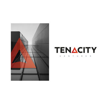
The brief was to be as simple as possible. A venture capitalist company that wanted a logo with a minimal approach. The form to represent the meaning of tenacity, which is a quality of not giving up. We had many a different directions till we found the one which matched their sensibility the most.
We gave value to the E in the name, which would stand for entrepreneur. There were four values we represented through it.. STEPS to show steady growth, a TILT to show progress in both axis, the form had a subtle hint of wings to depict a soaring idea or dream. And GRADTION to show increasing intensity in gradual growth.

Explorations
Other design directions that we developed for the same brief.
bottom of page


